Twilio - Super SIM
"How might we enhance the customer experience by providing personalized, real-time analytics for IoT device data usage?"
Overview
Overview
Twilio’s Super SIM is an enterprise solution that provides global cellular connectivity platform to connect IoT devices around the world.
Usecase:
For example, Twilio’s Super SIM, global connectivity platform enabled customers like Lime scooters to scale to 100M rides across 30 countries within few years.
Design a Report/Insights feature that allows Super SIM’s customers to review their usage data overtime and manage trends in their SIM’s activities by slicing and dicing their data using various filters.
Role
Solo Product Designer
Enhance current features while also minimizing team overhead. User Research, Interaction, Strategize, Wireframe, Hi-fidelity designs and Testing.
~2+ months (2022)
Problem Context
During the review of support tickets, we found that customers encountered challenges in identifying and resolving issues because they lacked access to necessary data. This resulted in frustration, leading customers to opening a support tickets.
Customer Context and Impact:
- Higher-than-normal invoice = Lost revenue
- Lack of ability to debug = Lost retention
Twilio Impact:
- Retention opportunity: $180,000+ annually
- Support ticket reduction: $250,000+ savings annually
- Support tickets: 80+ / monthly
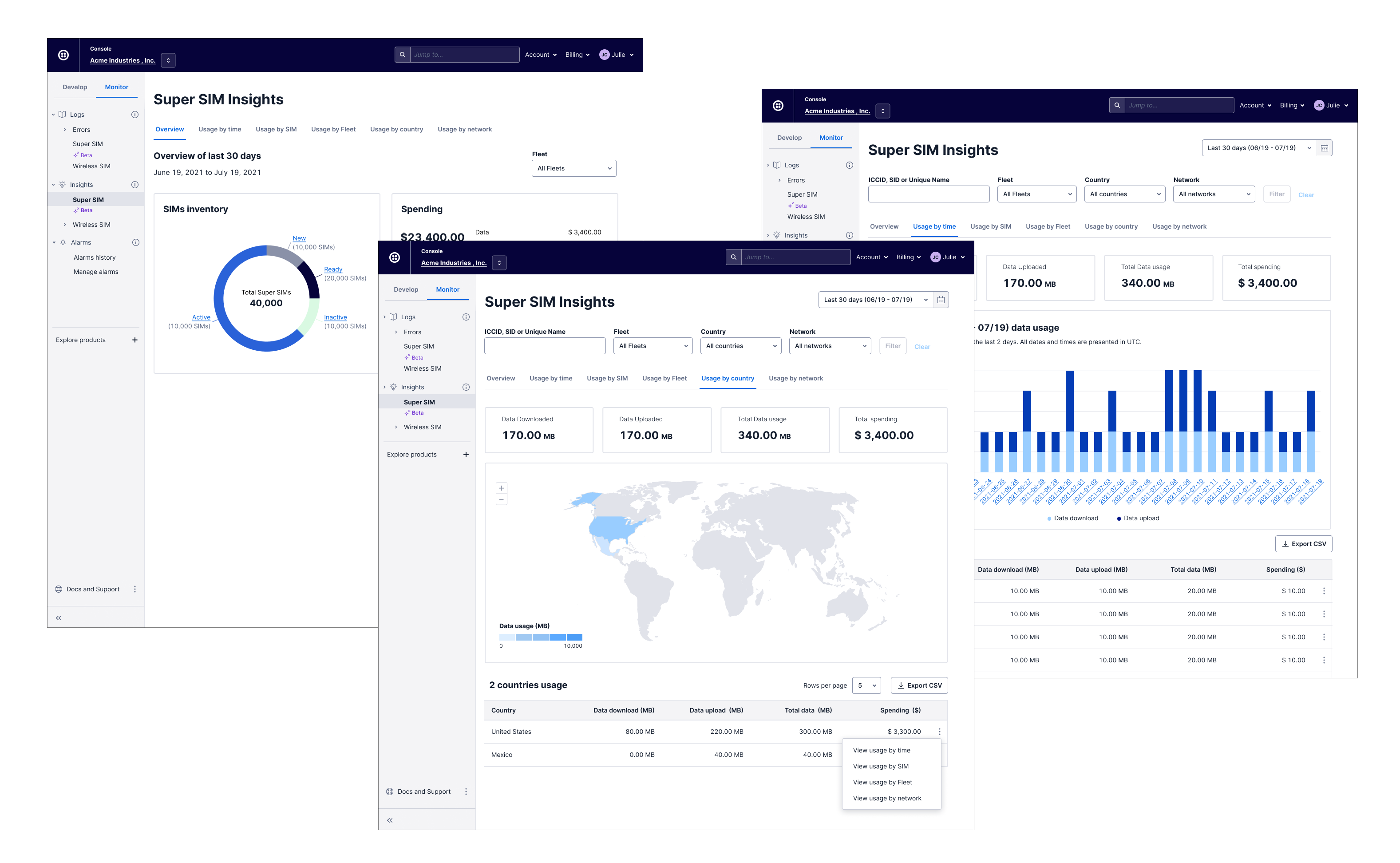
Super SIM Insights existing look
The current UI solution of the web application displayed only basic reporting on account-aggregated Super SIM usage. An alternative solution required users to integrate with the API, leading to user frustration due to limited access to their own data. As a result, users experienced difficulties resolving issues and had to seek assistance from the support team by opening support tickets. The IoT customer support team received an average of 80 support tickets per month related to their Super SIMs usage inquiries.
Business Goal
Our IoT business unit’s immediate business goal was to reduce the usage specific support tickets overhead.
Research
To empathize with customers’ pain, I begin the project with extensive research. My research objective was to comprehend our customers’ needs and wants.
Approach
12
Interviews with 12 customers110+
Reviewed # of support tickets30
# of Airtable Solution gapsLearnings
Based on our research findings, we have come to the realization that:
- Our initial hypothesis regarding the persona was incorrect.
- Our users were technical but didn't have time or resources for alternative solution, API integration.
- Current UI based solution was limited and didn't show data that could help user debug problems.
- Alternative solution was not for all customers since it was expensive.
- Integration with API required technical expertise and engineering skills.
Persona
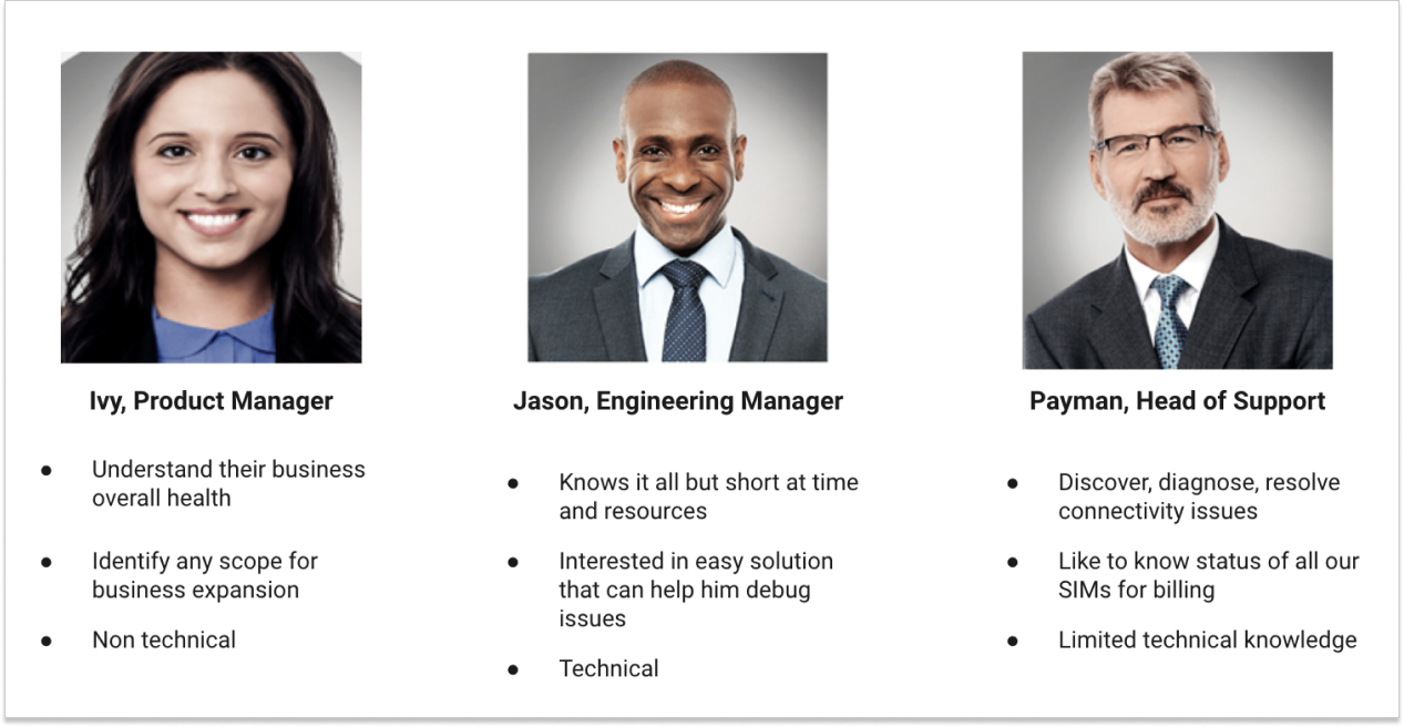
Define requirements
Having gained a deeper understanding of our customers' needs and use-cases, I set out to define the design requirements that were aligned with product and business vision. To achieve this goal, I shared my research findings with the extended team and invited them to a Competitive analysis and solution brainstorming workshops.
Competitive analysis workshop
During the research phase, we discovered that our users had compared our products with those of our competitors and found that some of our features were not meeting their use cases. As a result, we decided to examine our products more closely and compare them to those of our competitors. This allowed us to identify areas where we had missed the mark and develop strategies to improve our products accordingly.
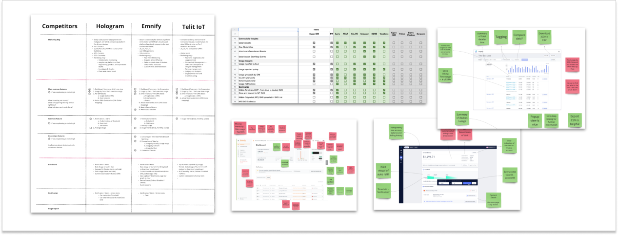
Brainstorming workshop
I moderated the brainstorming workshop session and shared research insights with the team. By organizing the information gathered during the research phase into common themes and patterns, we identified key areas of focus and potential problems that required attention.
- Organized information from research into common themes and patterns.
- Voted on most important and relevant problems to solve.
- Reframed top problems as "how might we?" statements.
- Used open-ended questions to encourage creative thinking and generate new ideas.
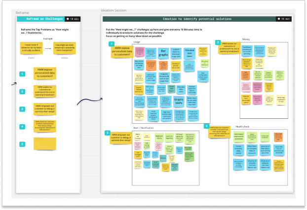
Learnings
We discovered that our competitors offered features that allowed for easy access to the dashboard, displayed aggregated data, enabled users to filter data for comparison, and provided deep linking of information to debug problems. These features were aimed at enhancing the user experience by providing them with easy access to relevant information and enabling them to quickly identify and resolve any issues that may arise.
Not only did these exercises helped us prioritise and define the requirements but as a team we were able to enhance our team's collaborations and replace the endless meetings and guesswork with tangible results.
Product requirements:
- Allow customers to view their data usage by Time, SIM, Fleet, Network, Country
- Scope - What is in scope and what is out of scope
Design requirements:
- Data visualization (graph + map)
- Allow Data manipulation (filters)
- Interactive elements (deep linking)
Wireframe
Next, I began generating ideas for the features and layout by creating low-fidelity wireframes for two distinct approaches. Despite achieving the same use cases, the designs differed significantly in their use of interaction and components. Design A aligned with competitors' offerings and included trend-based predictions, while Design B concentrated on all use cases of data insights metrics with individual reports for each use case
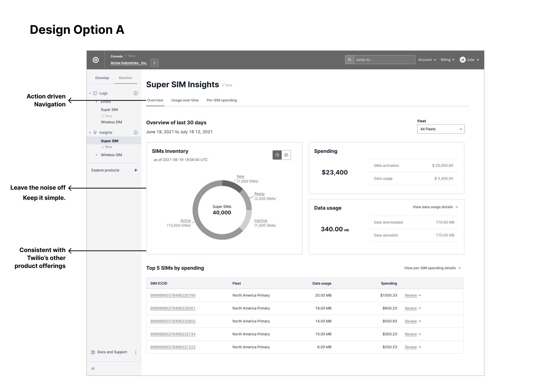
Design A aligned with our competitors' offerings, while also fulfilling all of the product requirements efficiently in just three reports. Additionally, it incorporated nice-to-have trend-based predictions and other desirable feature.
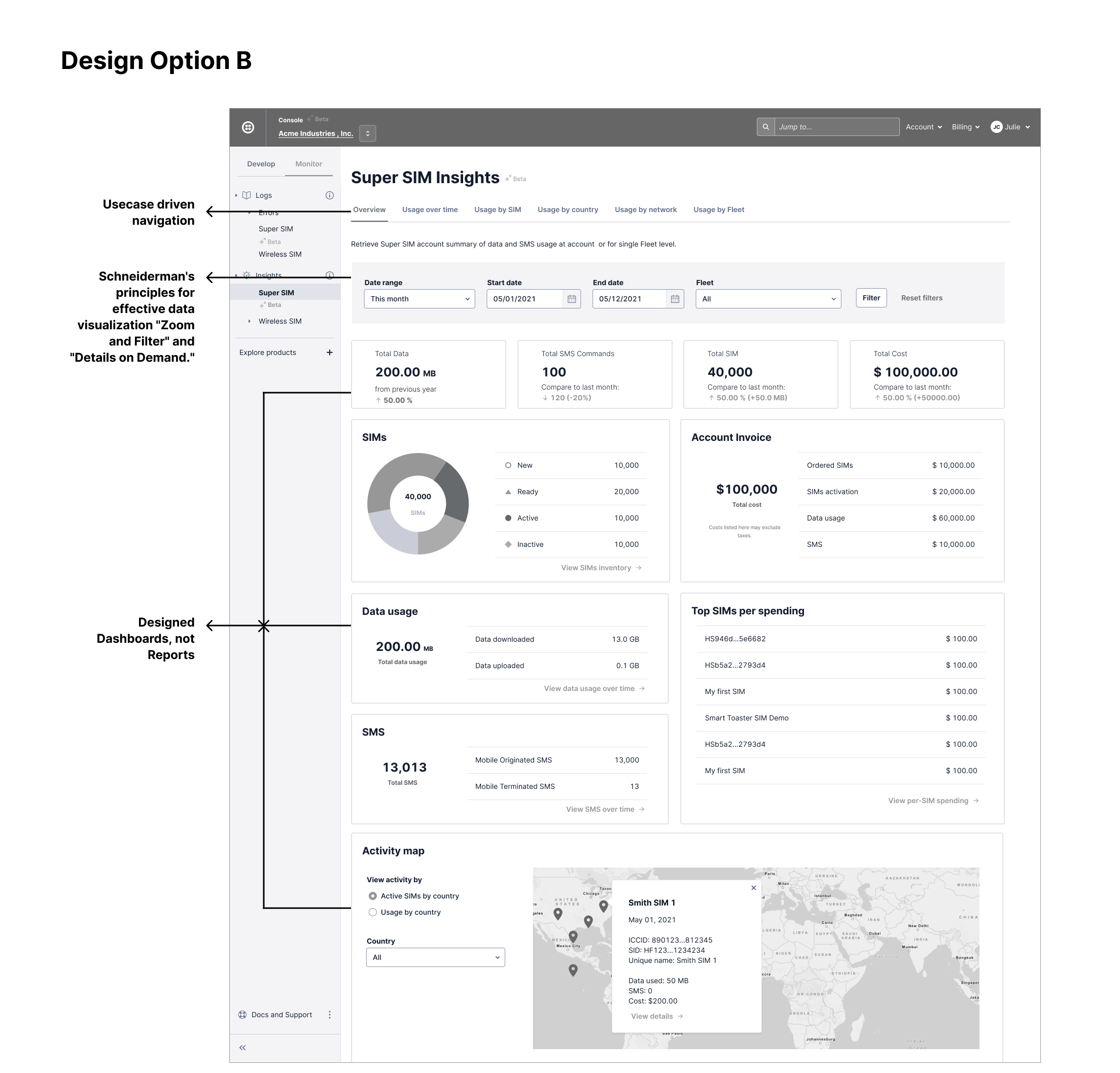
Design B remained focused on all the use cases of data insights metrics, including usage by time, SIM, country, and network, by avoiding unrealistic goals and maintaining a simple design approach.
Design feedback approach and learnings:
Upon completing wireframes we arranged a feedback sessions with 8 customers, got feedback from design peers and cross platform team. I created a script for the interviews, facilitated them as a moderator, and collaborated with the Product Manager to ensure the testing process went smoothly.
Overall users were happy to see simple yet effective UI.
Approach:
- Design Crits - peer feedback
- Cross platform team feedback
- Design System team consultation
- Conducted usability sessions with 8 customers
Learning:
- Users were far more successful in completing tasks using Design option B.
- In design opt B - The filter improvements helped customers sliced and diced their data better.
- Narrowed down the solution direction to design opt B.

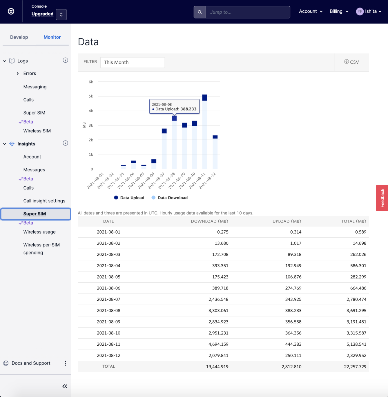
Hi-Fidelity Design
For the few weeks, I focused on designing the detailed interactions of the scoped project, including edge cases. I created my high fidelity mockups in Figma to allow the engineering teams to inspect the file and export the HTML and CSS code using Twilio's Paste Design System. Additionally, I worked with the Twilio’s Design System team to establish a new pattern for custom date range selection dropdown for all Twilio products.

Final Design

Final Design - handoff
My next step was to handoff my designs to the development team. My designs were created in Figma to allow the engineering teams to inspect the file and export the HTML and CSS code.
Design handoff approach:
- One-on-one meetings / Slack
- Figma walk through
- Access to Twilio's Design System components
- Stand-ups meetings
- Ensured that team felt empowered

Impact // Metrics


7000+
Page views / Month399
Applied filters800+
Support tickets (Reduced)We utilized a phased approach over the course of six months to implement feature improvements, continuously enhancing and refining them based on user feedback and data. The end result was a successful launch.
The team acknowledged and appreciated my role in the project, which aimed to enhance the user experience and decrease support-related costs. We emphasized the importance of user-centered design throughout the process, ultimately leading to a positive outcome.
Overall, the project was a success, with a satisfying conclusion for all involved.
Key Takeaway
- Assumption validation: After conducting our research, we were able to confirm our assumption and hypothesis that our persona had technical knowledge. However, our investigation also revealed that the persona was seeking a straightforward solution. They lacked the necessary resources and time to integrate with the API and were instead looking for a UI-based solution.
- The key to success was prioritizing ruthlessly and collaborating effectively, ensuring that efforts and resources were focused on the most critical aspects of the product
- If I were to improve something in my future projects: Will document my design decisions from start and often. Will help reference the design decision during the phase approach. in future and can also help achieve consistency.